Posts

Portfolio

Image
       So, this is my portfolio. It was originally going to be a sage green color, but I changed it to blue because I wanted to make it look more professional. I like neutral colors,  It makes things more modern  so  that's why I picked a more grey tone for the background. In the end, this class was a huge learning experience and Im glad I have more knowledge in adobe softwares and digital art as a whole. I am proud of what I have made in this class and it feels great that I can now present it to everyone else as well.

Business Cards

Image
  Business Cards      These are my business cards. I really likes ow they turned out overall. The first one is definitely my favorite because it includes all of my favorite colors. The second one I tried to make more professional and I really like the look of putting a white logo onto of my black version. I think it really gives the card some contrast with the dark colors it already has. The third one was to go for a more feminine look and I really like how the pink leaves on the plant tie In the entire card. The fourth was another card that I was trying to make look professional as well. I think it is probably the most professional on out of all of them. The fifth one is where I really wanted to add some bright colors and different shapes. I think I was going for like a cow print and I like how it turned out. The last one is definitely my most simple one but I look the cooler tones and the simplicity of it.

InDesign Homework #1

InDesign Homework #1 1.    https://www.youtube.com/watch?v=7VpAisbfldI      This tutorial was like any other beginner tutorial. It was short and briefly explained the in and outs of InDesign. Overall, it was sweet and short. 2.  https://www.youtube.com/watch?v=AshfNo-i8Ws         In this tutorial, the video explains all the basic tools that InDesign uses. Most of these tools I've already used in my illustrator projects but I didn't think it would help to refresh/ review them before working with InDesign. 3.  https://www.youtube.com/watch?v=mVW8AF2TMnw      In this tutorial the video mainly explains 10 essential tips for beginners. I thought this was a good video because unlike how other tutorials it tell you what not to do and why you shouldn't do them. I thought this was important because I wanted to focus on how to not mess up easily.

Autoscopy

Image
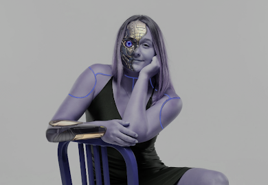
 Autoscopy     This is my autoscopy. My inspiration for this project was basically how much technology has advanced to the point where people believe that in the near future, they'll be androids/ robots living among us. As a computer science major myself I thought it was very fitting for me to add it into the project. Now a days people are almost constantly using some type of technology whether that be their phone or as a college student it's my computer. I thought it would be cool to take a look into what it might look like if we were the computers ourselves. Here are the images I used to create this project:

Somewhere

Image
  Somewhere      This is my somewhere project. For this project, we used photoshop to insert ourselves into a random photo that we weren't originally in. In order to do this I thought to myself and I figured that I had a few high quality lacrosse photos from my senior year. Considering this, I thought it would be cool to insert myself into a team USA team picture. I couldn't find a team picture that was high quality enough to put myself into so I went onto their Instagram and found a poster from there. Overall, I really like how my project came out. The Original Photo:

Re-Coloring A Black and White Picture

Image
           Re-Coloring A Black and White Picture                                                                                                                                          In this project, I used adobe photoshop to recolor different black and white photos of myself based on certain color schemes. For each color scheme I wanted to include a reasonable color for my skin. I also realize after the project that due to my dress being a dark color, most of the new colors turned out a different shade and didn't turn out as well. For the future, I would re-color a picture that had lighter clothing to make it pop more.

Photoshop Homework #2

Image
https://www.instagram.com/kirbyjenner/?hl=en ; find 1 image you think it would be really hard to photoshop yourself in to.             -An image that I think would be really hard to photoshop myself into would be this one because the picture itself is kind of  low quality and I feel like that would be hard to recreate. Also, I think it would be hard to get the lighting right. https://www.instagram.com/averagerob/ ;  find 1 image that inspired you or gave you an idea for the "Somewhere" project - An image that gave me an idea for the "Somewhere" project was this one because I think generally it would be cool to say "look I have this really cool picture of a celebrity and I" and it turns out it's just a random image of you a photoshopped next to a celebrity doing something weird.   https://www.boredpanda.com/funny-photoshop-troll-james-fridman/   find 1 set of images that made you laugh. -This image made me laugh because there is literally nothing wrong

Tag Brush

Image
Tag Brush     This is my tag brush. I really enjoyed this project, considering I got to use my personal logo to create a personal tag. I really liked how this turned out, it kind of reminds me of a stamp but like in spray paint form. I chose pink for the color because I wanted it to be more empowering towards me and to me as a strong woman. 

Introduction to Adobe Photoshop (Assignment 1)

  Introduction to Adobe Photoshop  https://www.youtube.com/watch?v=vDhv1o7cA_I      When I was browsing on the internet for an intro to photoshop video I really wanted something that was simple and would just give me a brief idea of what Im going to be getting myself into for the next week or so. I thought this video specifically did a great job of that. They talk about the main features of photoshop and what its most common applications are. I didn't realize that you could make animated gifs on photoshop so that was a really interesting feature that they talked about. I am most excited to be able to try out the digital painting feature as well. https://youtu.be/3gxcIn8L__w      For this next video, I still wanted something that would touch the basics for photoshop but also get into the specifics of the small details that play apart of the entire piece of artwork itself. So I found this video called "layers for beginners". It basically touches up on tools like the move

Self Portrait Propaganda

Image
  Self Propaganda Portrait        In this project, I used Adobe Illustrator to create a self portrait of myself and my self portrait image turned into inspirational propaganda. All of the shapes created were done by using the pen tool other than the text of course. My inspiration for my propaganda art was bight and bold colors, but I actually decided to add a cool touch to the color scheme by adding purple which I think really evened it out. The phrase "Be the Change" basically means if you want to go out and do something, just do it! Be the change!

Personal Logos

Image
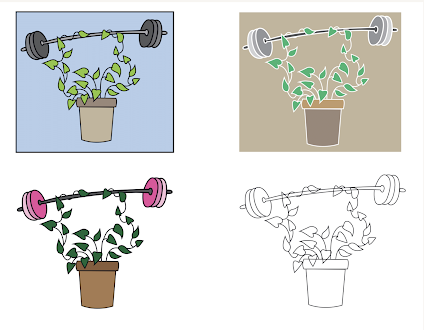
 Personal Logos      In this project, I used Adobe Illustrator to create a personal Logo for myself that could describe who I am as a person. I thought to myself well, I really love my plants and I like going to the gym and being active, so that's what I created. I think these logos show my need to grow and learn, and my determination and strength. Other than the coding project, this is by far my favorite piece that I have made so far. I used the pen tool to create all the shapes and it took me around 3 hours for my base piece and than about an hour for all the colored pieces.

Caligram Project

Image
  Caligram Project      In this  proje ct, I used Adobe illustrator to create a calligram art piece. I remember in high school doing a calligram project where we had to hand draw an image and then hand write the words in and let me tell you, this process is way easier. My original inspiration for this project was going to be a flower but I soon realized that I wanted to do a different concept, so instead I did a hand skeleton, with each of the bones having their names incorporated into the image. I really liked how this turned out and I think this was one of the most tedious project  next to the coding project.

Canvas Project

Image
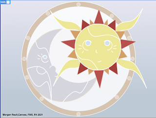
 Canvas Project       In my project I used Dreamweaver with HTML Canvas, to create a piece inspired by a stained glass picture that I found online while researching for this project. I chose to do a stained glass piece because I realized it would be the easiest way for me to create figures using lines and basic shapes. My piece contains a basic background gradient, small and large circles, half circles, many tirangles, bezier curves, and quad curves. the main reason I decided to do this stained glass price was because I really liked the sun and the moon design and I wanted to be able to make it my own. However, instead of making the faces super realistic I decided to go with a more simple theme because I thought it looked cuter.     This was my first time ever using Dreamweaver or any type of coding system and I have to admit I really enjoyed making this project. I thought it was really cool how a string of words can make actually 2D shapes. I found it the hardest to understand the be